Pusateri Bros. Landscaping
Client
Pusateri Bros. LandscapingMy Role
Researcher & UX/UI DesignerTools
Excel, Optimal Workshop, and FigmaBackground
Pusateri Bros. Landscaping is a landscaping company in the Wexford/Pittsburgh, Pennsylvania area. For my ‘Information Architecture and Content Strategy’ course at University of Toronto’s School of Continuing Studies ‘UX Design’ program, I was asked to do a user experience overhaul for the ‘Pusateri Bros. Landscaping’ website.
Client’s goals
1) Offer information that’s most relevant to the users
2) Help promote the company’s brand and values
3) Gain a competitive edge through better content
4) Be seen as an expert in the field



Problem
In the competitive landscaping market of Wexford-Pittsburgh, homeowners and business owners seek prompt, professional service for weather-related and routine landscape maintenance. The current Pusateri Bros. website, which is disorganized and difficult to navigate, may deter users seeking reliable service, risking potential customer loss before quotes are even given.Solution
Instil confidence into potential clients by demonstrating precision, speed and professionalism throughout the website experience. Click here to jump to the final product.
Qualitative Audit
Discovering the Landscape
First, I conducted a qualitative audit that evaluated the key messages, metadata, content quality, voice and tone, effectiveness and calls to action for every page on the Pusateri Bros.’ website. Here are some of the findings:Repetitive and redundant content that’s difficult to go through.
Grammatical and spelling errors, which translates to poorer SEO ranking and brand quality perception.
Inconsistent use of buttons, formatting and tone of language = cognitive overload.
Content most useful to users is placed too low on the pages — if at all.
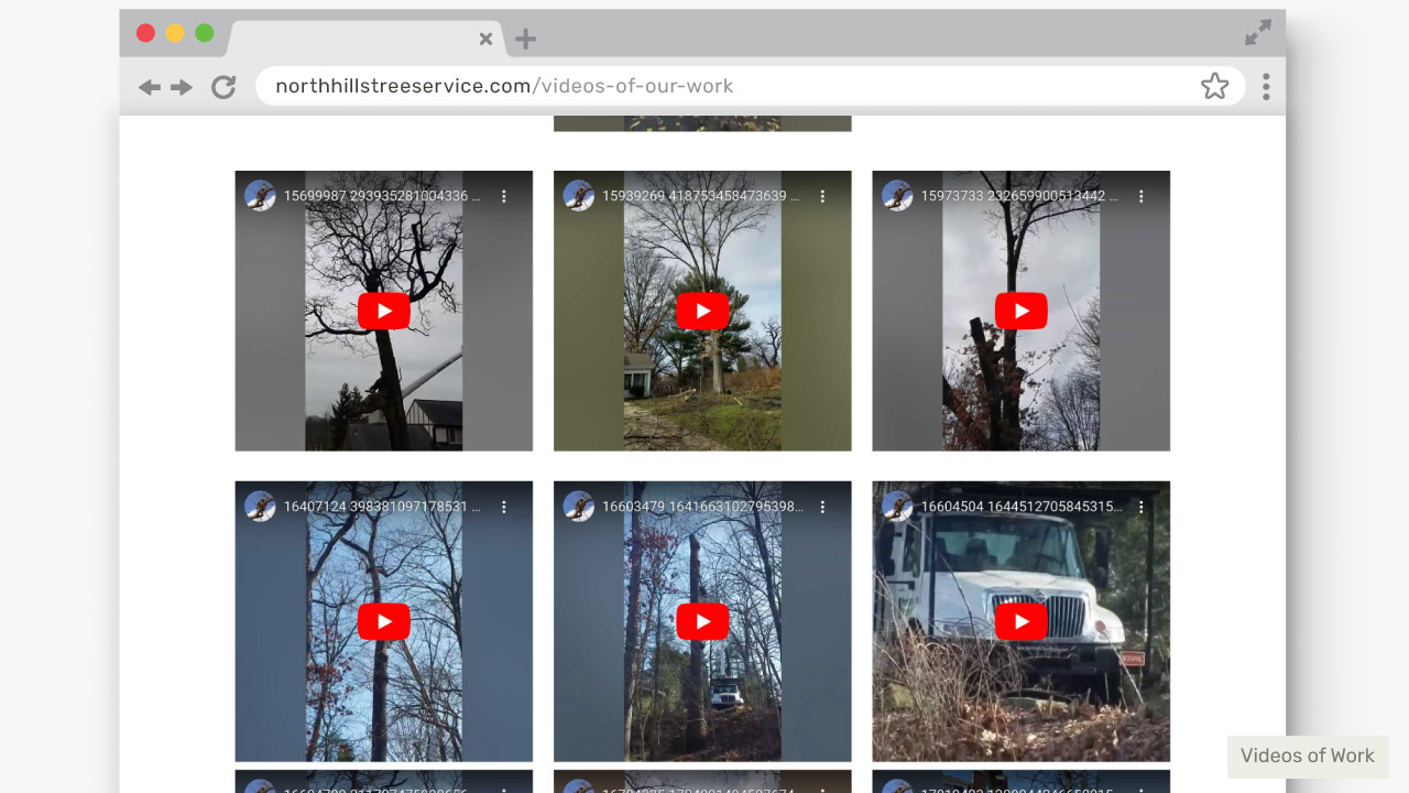
Images and videos are missing alt text and/or captions.
The quality of photos, videos and details need improvement (i.e. pixelated photos, portrait oriented videos, etc.)
SWOT Analysis
Competitor Analysis
Next, I conducted a SWOT analysis for a couple Pittsburgh-area landscaping companies with comparable services.Adler & Sons
![Adler & Sons SWOT analysis]()

Jack’s Tree Service & Landscaping
![Jack's Tree Service & Landscaping SWOT analysis]()
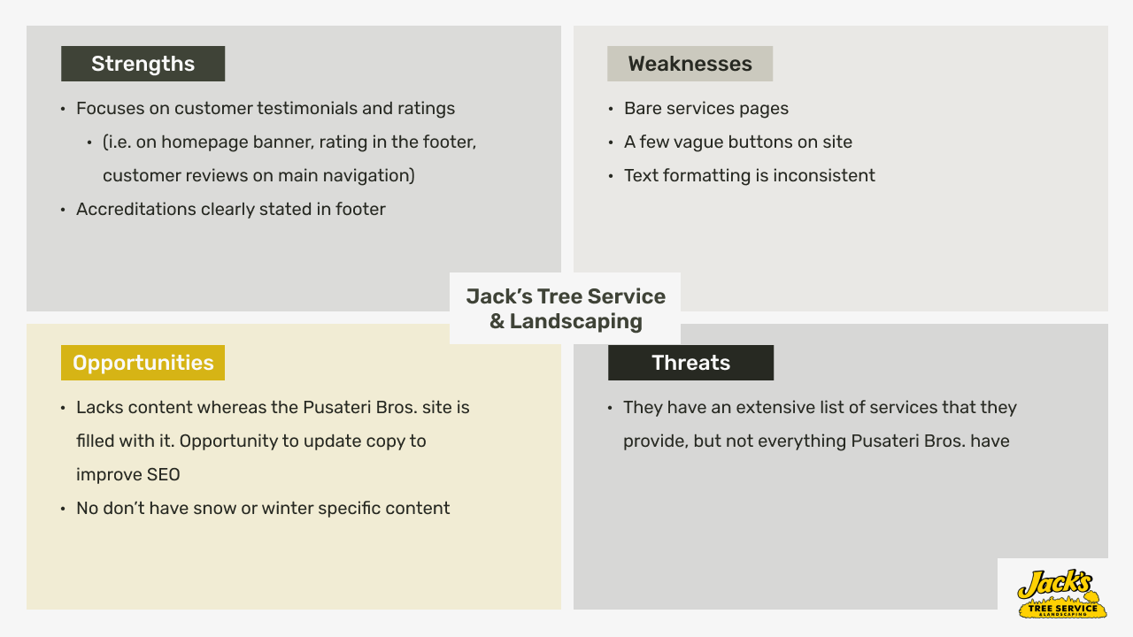
Despite the visual appeal and features of competitors' sites, Pusateri Bros.’ strong service record and positive customer feedback highlighted opportunities to leverage these strengths online.
Current Sitemap
I was asked to review the website’s navigation and the content within the pages to evaluate how it can be improved upon for users.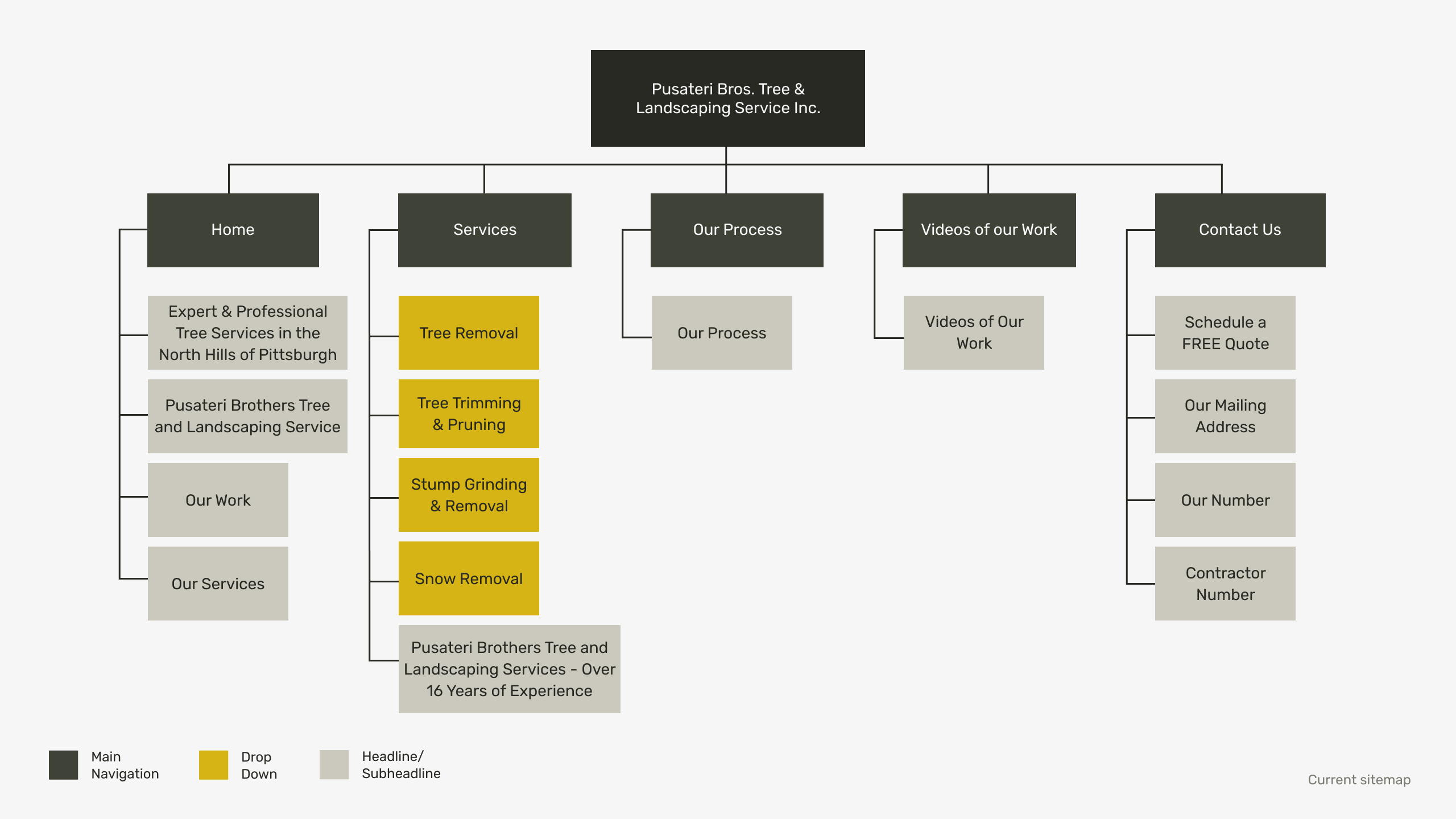
Closed Card Sorting
Testing the Building Blocks
To evaluate the logic of the current sitemap and the content within it, I conducted a closed card sorting exercise with Optimal Workshop. The participants were given the main navigation titles as the categories whereas the drop downs and subheadlines were the cards.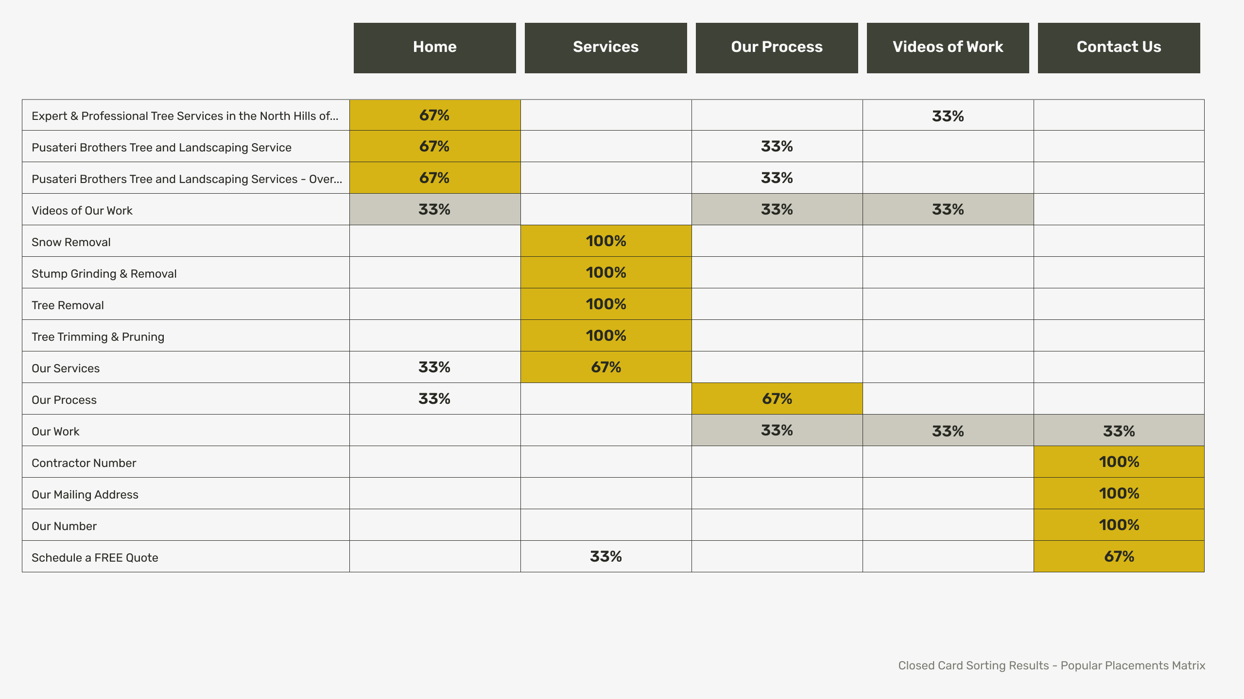
Confusion
Sections were not clearly labelled enough to ease navigation throughout the site.
“What is ‘Our Process’?...is it the process of how they work? I’ve never seen ‘Our Process’ on a website….”
Sections were not clearly labelled enough to ease navigation throughout the site.
“What is ‘Our Process’?...is it the process of how they work? I’ve never seen ‘Our Process’ on a website….”
Irrelevance
Content was repetitive and cluttered which distracted and delayed participants.
“Seemed like a lot of repetition for the homepage introduction.“
Content was repetitive and cluttered which distracted and delayed participants.
“Seemed like a lot of repetition for the homepage introduction.“
Hierarchy
All the participants said their ranking of cards was based on relevance, which speaks to what users expect from a website that provides a service.“Ranking services based on relevance/most commonly searched.”
All the participants said their ranking of cards was based on relevance, which speaks to what users expect from a website that provides a service.“Ranking services based on relevance/most commonly searched.”
Persona
Pinpoint the User
Drawing from research on Pittsburgh, its communities, the residents, and other landscaping-relevant factors, I developed a user persona to steer the website's revamp.
How might we...
Make users feel confident in Pusateri Bros. Landscaping services that would be quick, safe and professional.
Solution
Instil confidence into potential clients by demonstrating precision, speed and professionalism throughout the website experience.Product Requirements
Tools to be Used
The research conducted revealed several pain points that need to be addressed to satisfy user needs.


Clean Cut & Trimmed
Trim overall content to only include relevant information that doesn’t overwhelm users and reduces cognitive load.
Trim overall content to only include relevant information that doesn’t overwhelm users and reduces cognitive load.
Rebrand
Create a brand voice and look by revamping the UI with a clean, modern and professional look that will speak better to the business and what users should expect.
Create a brand voice and look by revamping the UI with a clean, modern and professional look that will speak better to the business and what users should expect.
Perennial Service
Highlight a major customer benefit of hiring Pusateri Bros.: Users save time and effort by using one company for high quality year-round service of all landscaping, emergency and yard needs.
Highlight a major customer benefit of hiring Pusateri Bros.: Users save time and effort by using one company for high quality year-round service of all landscaping, emergency and yard needs.
Revamped Sitemap
Rebuilding
To ensure a cleaner site, I merged pages and adjusted the hierarchy of information.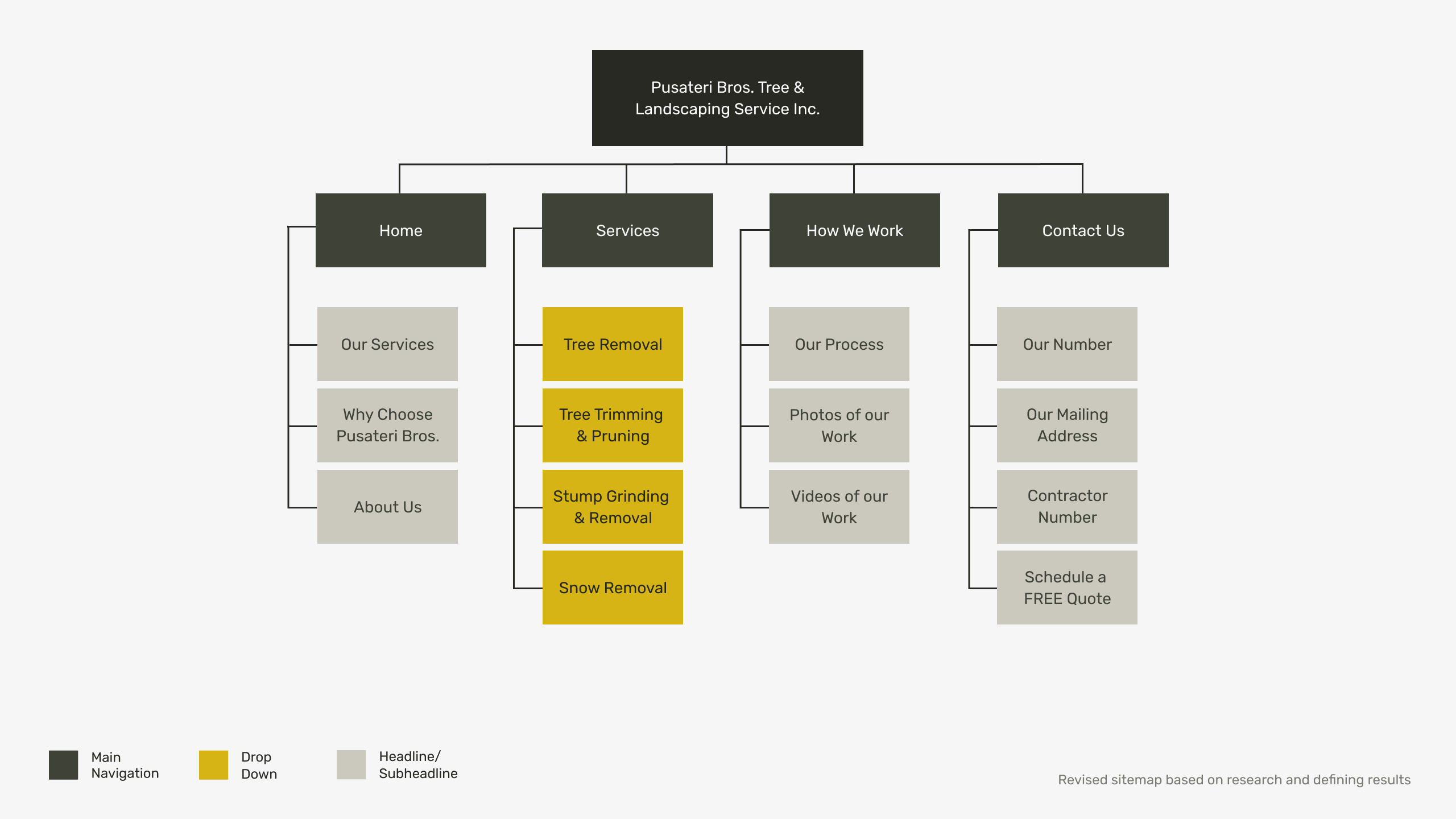
Sketches
Designing the Blueprints
I sketched multiple iterations and planned interactions that could address the client’s goals while improving the overall user experience.
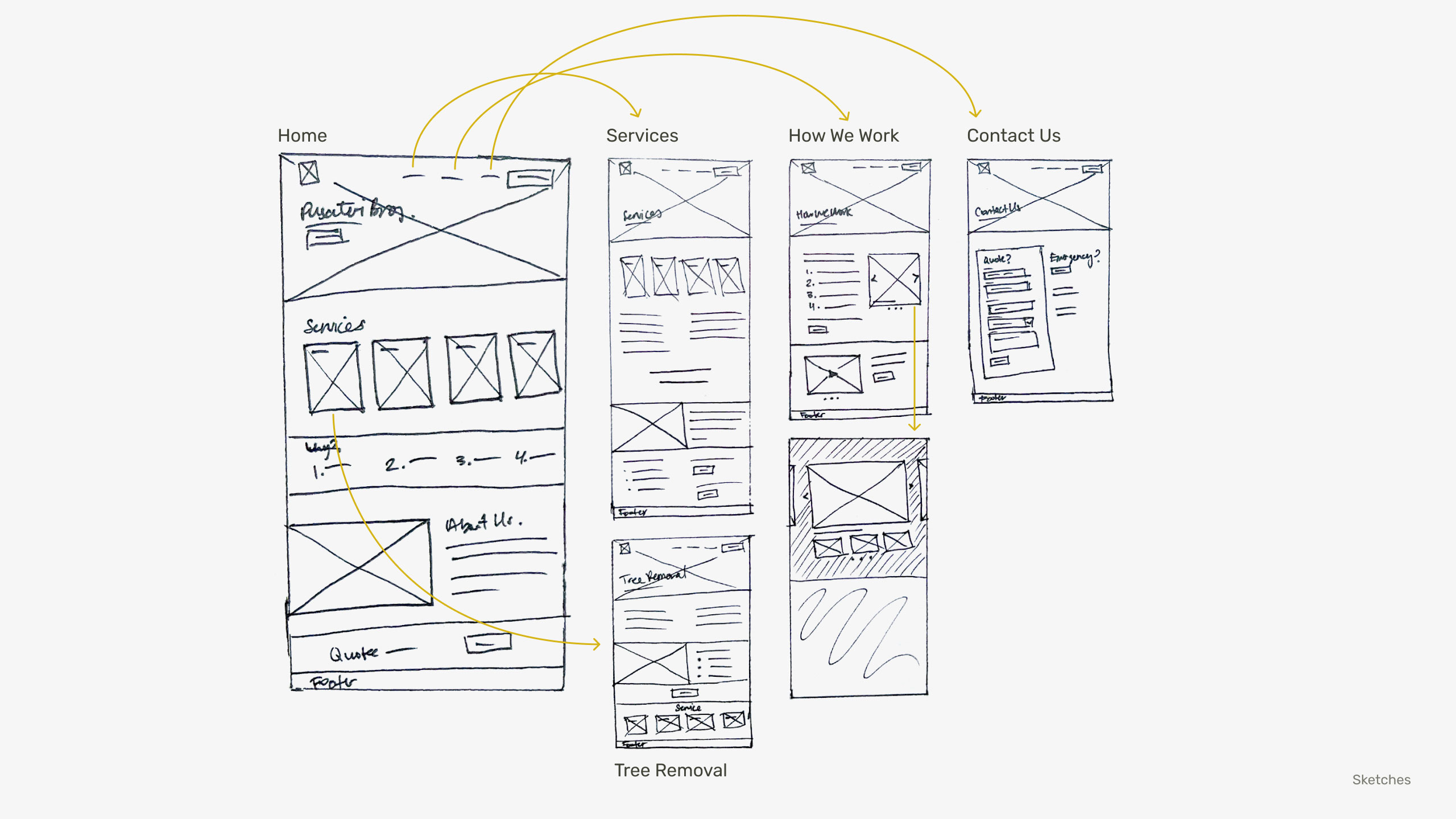
Wireframes
Finalizing the Explorations
From my selected sketches, I built out wireframes. I kept in mind easing site navigation and making content digestible to meet user and business needs.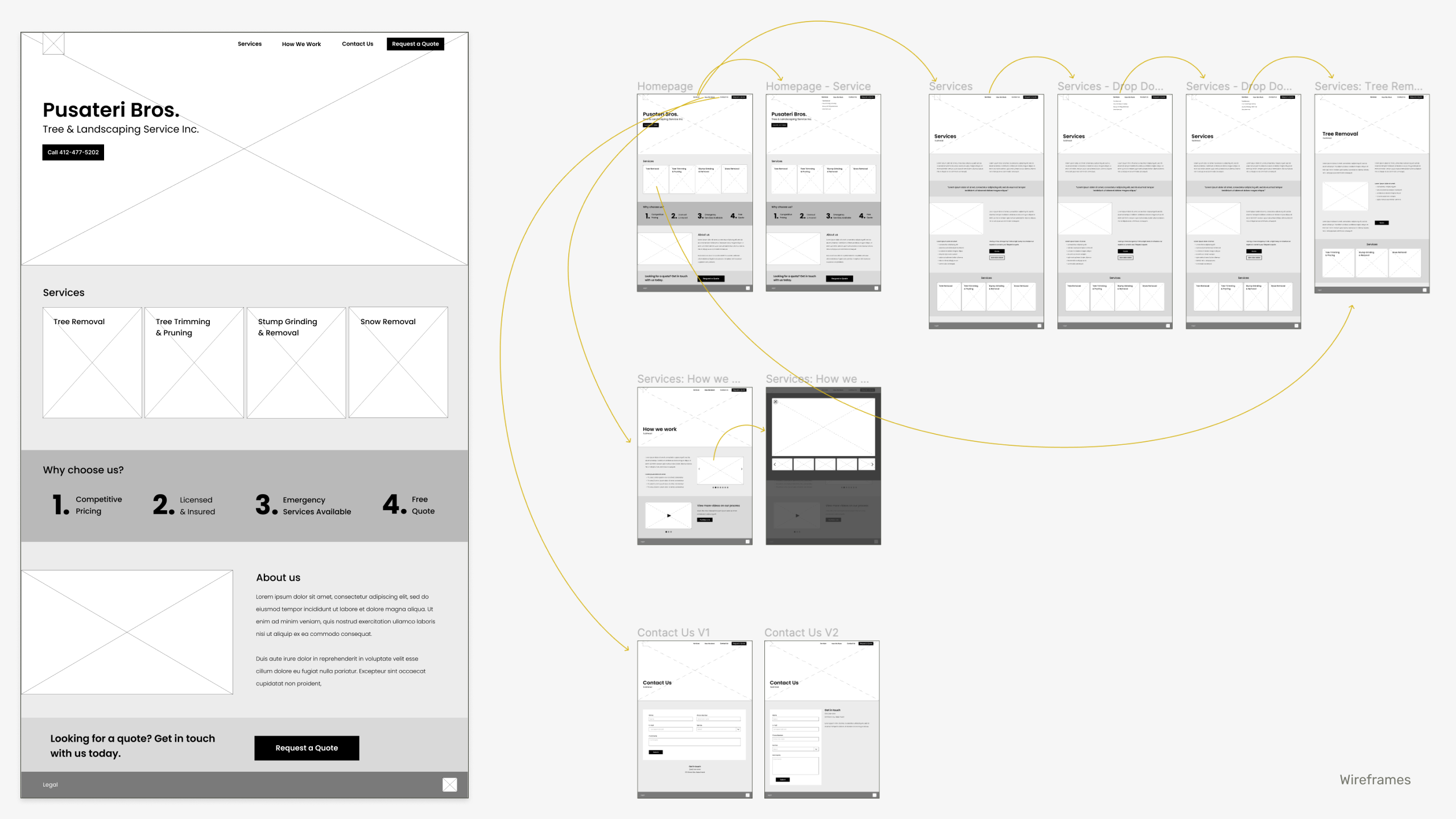
High-Fidelity Prototype
Bringing all the Elements Together
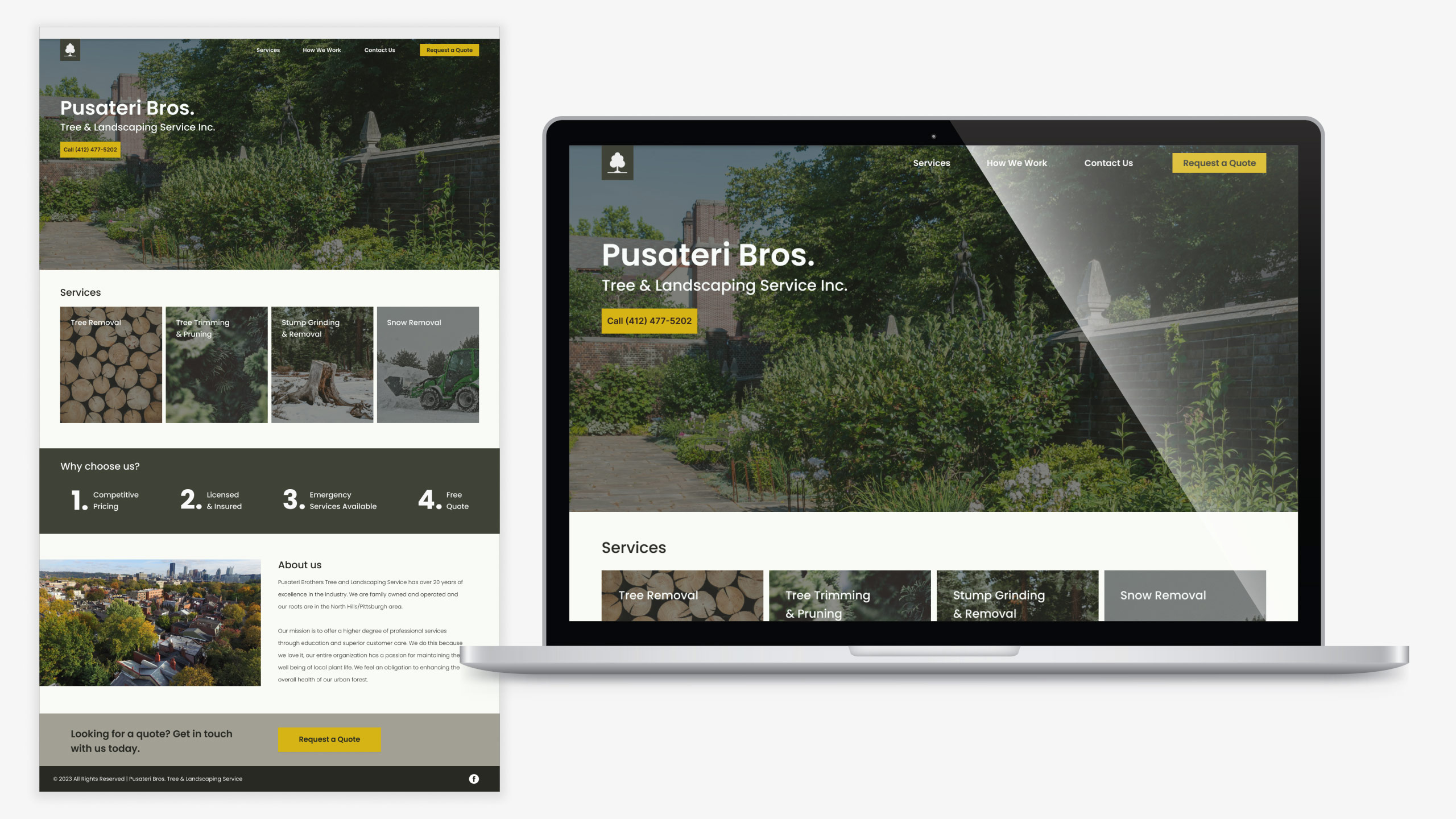
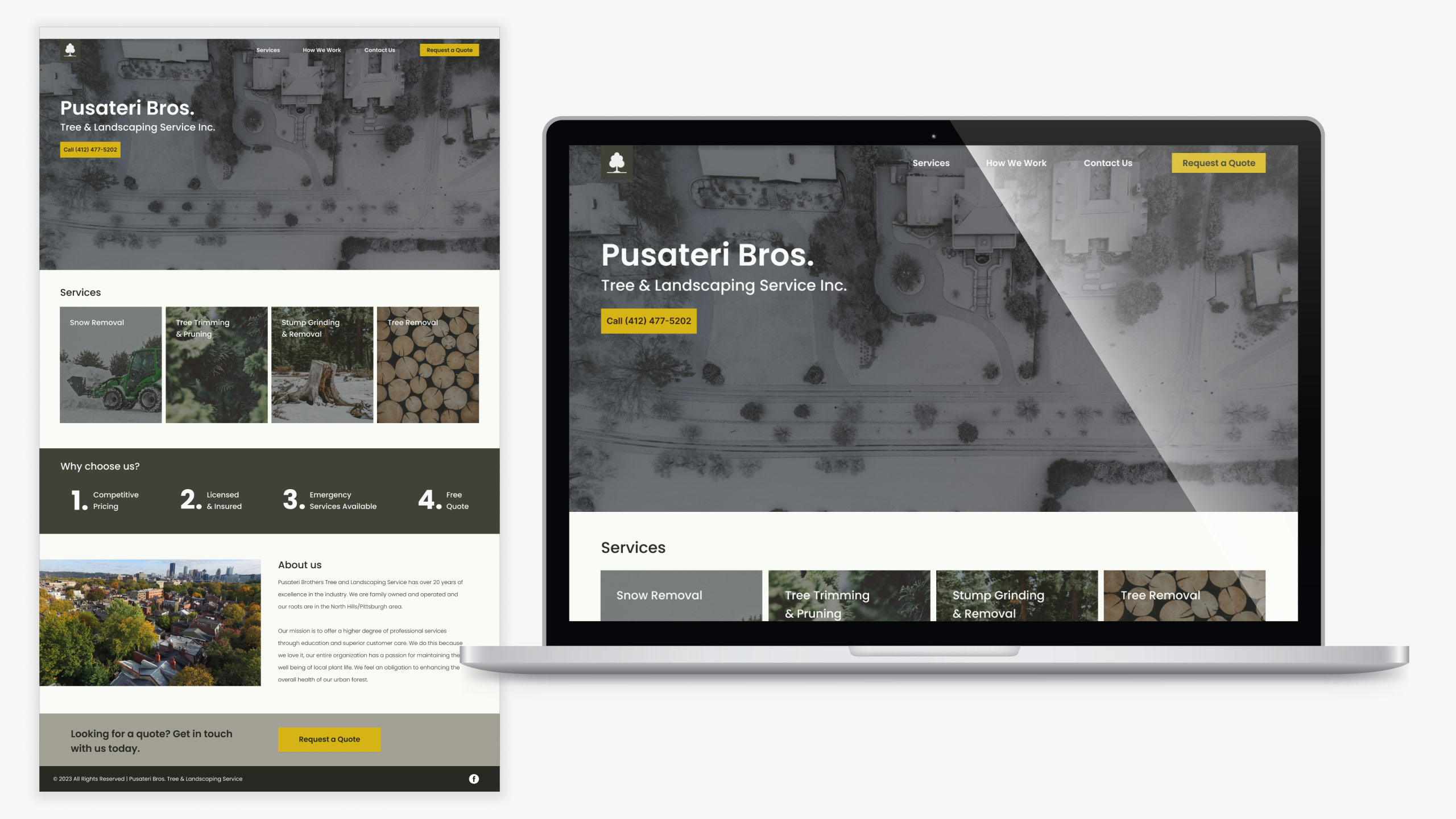
For the homepage, I streamlined the content to feature only essential sections: services offered, unique selling points (USPs), about us, and contact options. I simplified the main navigation for clarity and user-friendliness. Content hierarchy was reordered by relevance.To reduce visual clutter, the logo was simplified. I produced winterized content to highlight Pusateri Bros.’ services, which will require semiannual maintenance to remain seasonally appropriate.

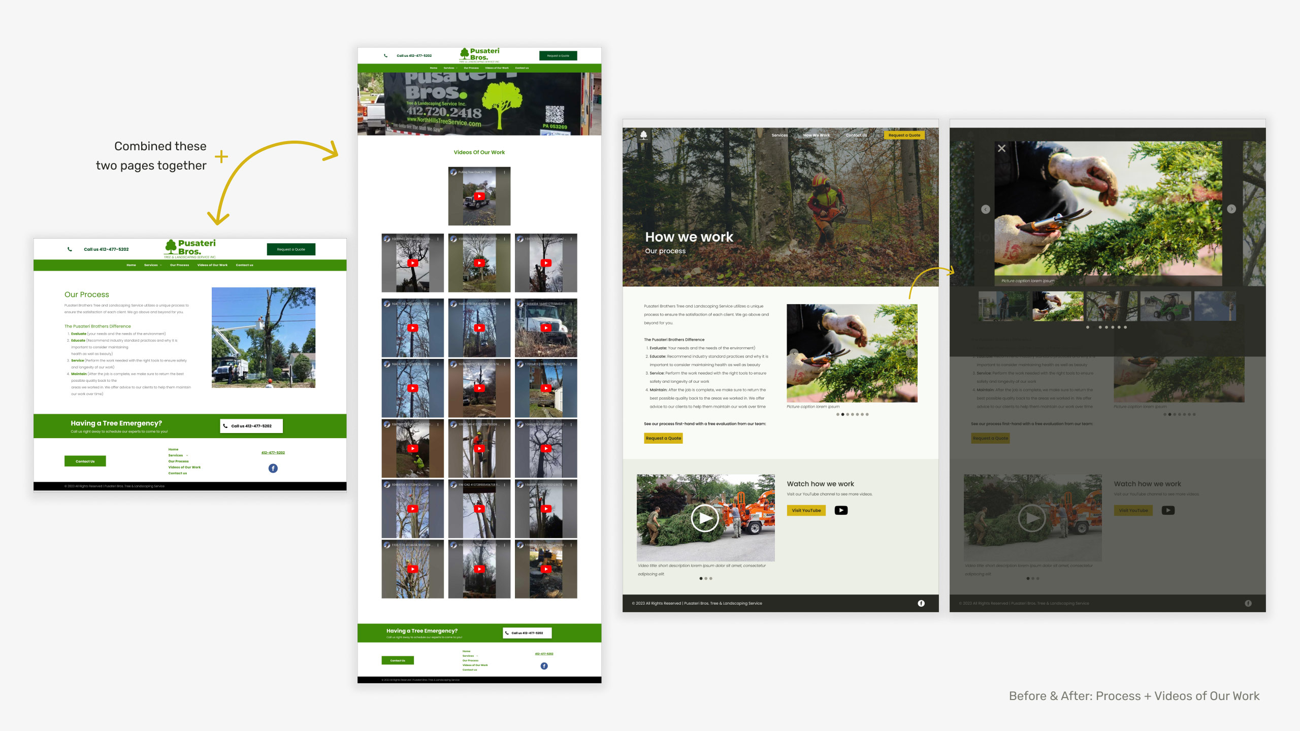
Before and After
Key Pages
Here are before and after images of a few key pages throughout the site. These changes were based on the key findings and improving the website’s UX.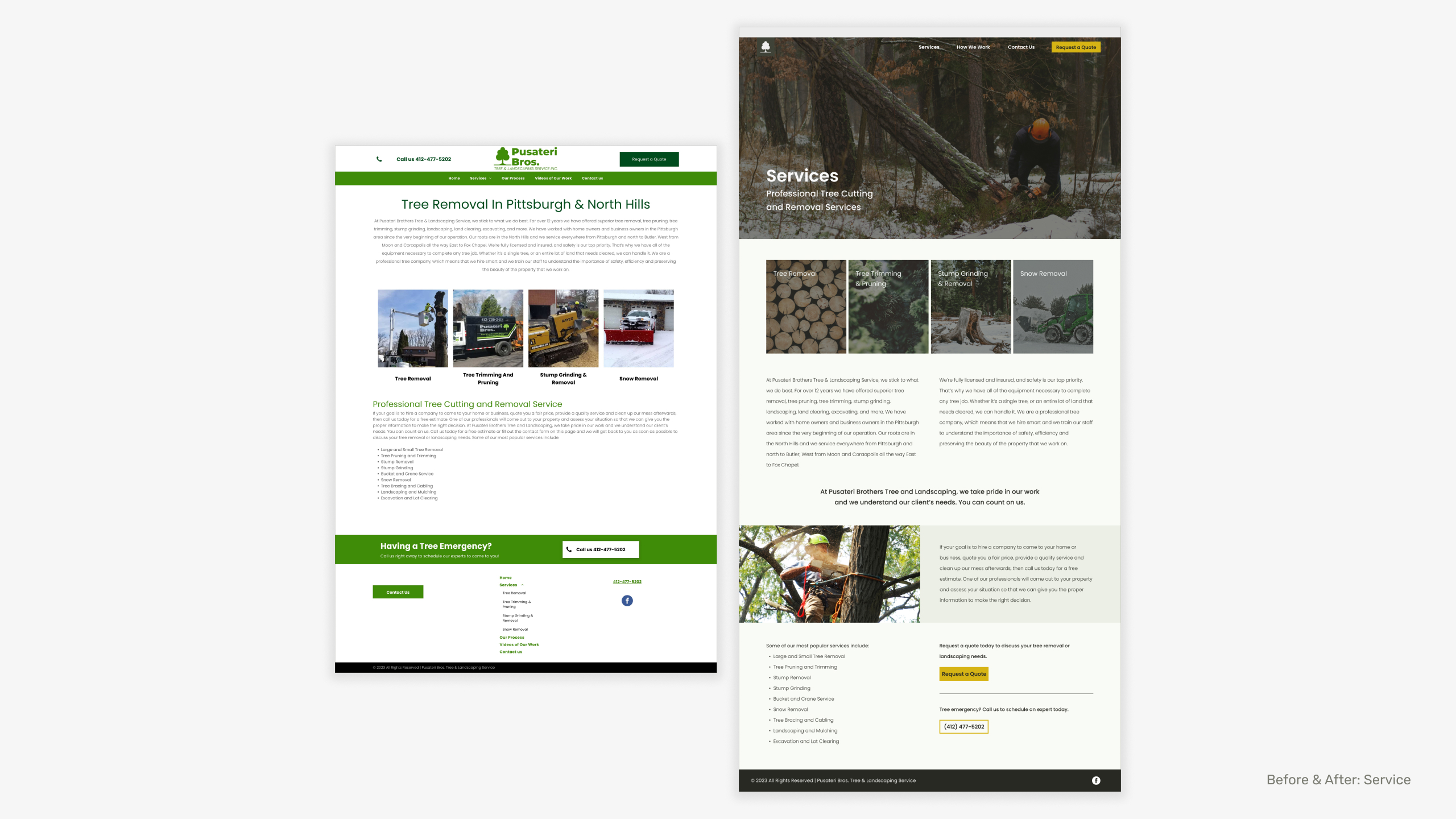

Interactive Prototype
The Website
Take a look at the interactive prototype to see the website’s updates on all pages.Mood Board, Colour Palette & Elements
The Style Guide
I chose a subdued green palette for professionalism and integrated Pittsburgh's local colors, history and shapes, like yellow (bridges sports teams) and geometric elements, for a familiar feel. The font selection prioritizes readability to complement imagery and navigation.

Future Steps
Continuing the project, my next steps would include:- Condense site copy further for greater clarity
- Refine mobile responsiveness
- Analyze post-revamp performance metrics
- Invest in marketing to attract site visitors
Back to top︎︎︎

